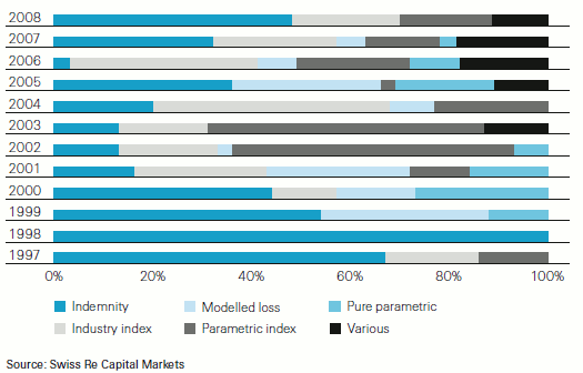
The latest Swiss Re sigma study, which I posted about yesterday, contains some great graphics which demonstrate how the market has evolved over time. Imagery makes it really easy to visualise the changes the market has undergone. One particular graphic that I like shows the different types of triggers utilised in transactions over the years. It clearly shows how certain triggers go out of favour and then sometimes return to favour, such as the indemnity trigger which was the trigger of choice over ten years ago, then swiftly lost favour only to return last year to be part of almost 50% of catastrophe bond deals. I think 2009 would make an interesting addition to this graph but we’ll have to wait till next year to see that.
 View all of our Artemis Live video interviews and subscribe to our podcast.
All of our Artemis Live insurance-linked securities (ILS), catastrophe bonds and reinsurance video content and video interviews can be accessed online.
Our Artemis Live podcast can be subscribed to using the typical podcast services providers, including Apple, Google, Spotify and more.


